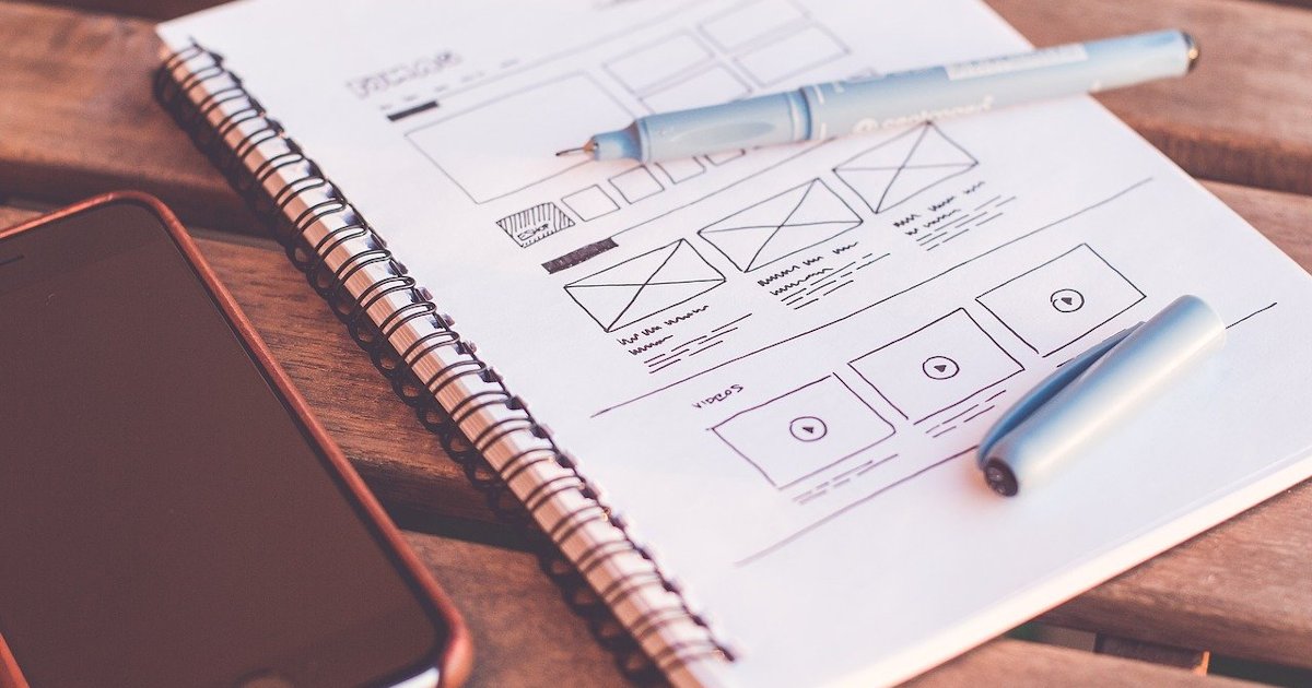
Designing apps and websites is no easy feat – designers will go through different designs before one is ultimately selected. But in a fast-moving industry, trends will change quickly and we need to be able to adapt quickly. Dubai website design agencies understand the need to stay up to date with trends.
Here are some of the best design trends that you need to keep an eye out for!
Bold Colors
An upcoming trend for apps is bold and vivid colors. Many app designers will attempt to fit in all the colors of the rainbow into their app designs, but colors such as purple, blue and neon colors tend to stand out. They’re exciting colors when compared to earth tones, and they catch the eye quickly. These colors also pop out really well against darker backgrounds, giving them a unique, bold and futuristic look that is appealing to the general audience.
Designers are starting to play with colors more also because of the fact that mobile devices are now better equipped to show off vibrant colors to their full potential.
Dark Mode
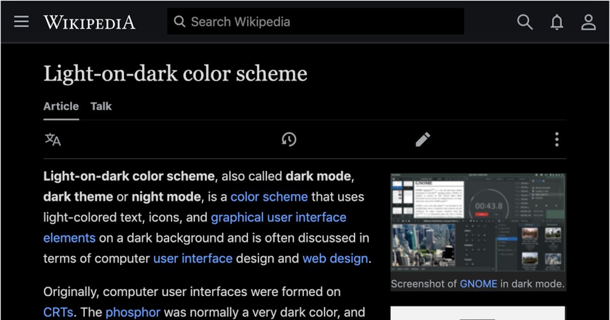
Dark mode has really kicked off within the last two years. With more operating systems and apps integrating the feature in, users who don’t already have access to the functionality are asking for it more frequently. Not only is it easy on the eyes, but it helps maintain battery life too – something that I think we all can agree is important especially in 2020.
App designers are starting to adapt to mobile habits and focusing on darker themes. Some make use of neon colors to pop out against the darker backgrounds, while others focus on more simple colors. Nonetheless, dark mode is trending upward and it will be here to stay.
Bold Illustrations
Illustrations have already seen a rise in popularity in 2020. Flat illustrations nowadays are contrasting and eye-catching and consist of colorful palettes that make apps feel more authentic and less like you’re using stock photos. It presents users with a friendly environment that’s more welcoming and inviting.
Simple Fonts
Simple fonts have always been constant with the app and web design. Designers and developers have acknowledged that users don’t want to look at fonts that are too ostentatious. Simplicity is key.
Sans Serif, in particular, is dominating the typography scene. Of course, they have been utilized in app design for years now, but users and developers alike are starting to appreciate the simplicity more than before.
A common practice that designers make use of involves combining two kinds of fonts together to separate headlines from supporting or smaller pieces of text. This could be done for names of features, dates, events, etc.
Transparent Elements and Gradients
A trend that never seems to die down is the use of gradients. Whether it’s on a website, social media pages or apps, designers are making use of gradients to showcase more colors in a more visually pleasing way. When using brighter colors, gradients allow designers to do so while looking lightweight and not too in-your-face.
To add to the subtlety of gradients, overlays and bursts of color are being toned down by being adjusted to be transparent on screens.
Animations
With everything on the internet, users can’t resist a good animation. Animated graphics make everything come to life. Even if the tone of your app is more serious and formal, you can still make use of animation. You could animate your logo or even the text on your app.
Personalized animation is also making a splash in app design. With personalized animation, elements on the screen will change based on the user’s habits and behavior.
Skeuomorphism
3D as an interface style is making a strong comeback in the form of Skeuomorphism. This design principle makes the interface elements mimic real-world objects on your screen. Shade, lighting and details all increase the user’s immersive experience, removing the barrier between the app and the user and personalizing the experience even more.
Storytelling
Now, storytelling might not seem like a “trend” per se, but it’s an important factor to consider when creating anything.
Storytelling on apps is a unique way to interact with users in more engaging ways. To tell a story, you can incorporate animations, text and even illustrations. Keep in mind that you need to tell your story effectively so that the user doesn’t have to take multiple actions in order to get to their destination. The flow needs to be smooth throughout their user experience so that they don’t leave your website.
Soft Shapes
Shapes that are more rounded, soft and organic seem to be picking up traction in the design world. Not only do newer apps try to incorporate these shapes, but websites have started doing it too. These shapes help websites and apps look less intimidating or cold, inviting more users to engage with the platforms. They provide a sense of comfort to users as they’re not obtrusive objects that are too in-your-face.
Umer Bilal is a expert Internet Marketer at www.Grafdom.com – a website development, Web design, social media organization based In UAE, Dubai, Abu Dhabi, and around the middle east areas. The agency designs dynamic websites, manages viral marketing campaigns, develops mobile apps & provides robust hosting solutions for some of the most recognized brands

