The human brain learns new things by looking for patterns. They range from sounds to visuals. We look for patterns in our environment to find meaning and sense in the world. In business, you might not be conscious of it but you are telling a story every time you are creating a slide deck or a report to explain a process.
Above all, you are sharing the story of your brand to potential clients and existing customers every time you create content that will inspire and propel them to take action. However, telling stories is just not enough. How you choose to tell the story matters. The choice of medium matters a lot.
Why you should choose infographics
Who doesn’t love looking at pictures? Numerous research studies have shown that mixing visuals with text is one of the most effective ways of promoting a learning environment, boosting memory, and improving persuasion skills in business.
Similar to other visual content forms, an infographic combines texts and visuals to represent data or information usually to inform or educate an audience. Here are a few great reasons why you should choose infographics to get the attention of your audience in school, business, or work.
- Persuasive and eye-catching: People enjoy learning something new – especially numbers, statistics, and figures. Infographics are the best when you want to compile lots of data into one simple format that looks nice and persuasive. Your audience will appreciate how you present your information because it will be compelling and credible. The information will be credible because it will be easy to understand. Infographics are good at helping people synthesize new data. This means that your presentation will help them get new insights which will increase the value of your content. When people gain new insights, the content becomes memorable. And they are likely to look at it again and share it with their colleagues and friends.
- You become an expert: When you combine text with graphics, you’ll have a perfect marriage. Sharing information through infographics positions you as an expert and increases the credibility of your brand. Creating a compelling infographic takes knowledge, time, and experience – things that your readers don’t have. Readers will appreciate your knowledge and think of you as an expert. Infographics enable you to present your research visually. Your audience will connect your ability to tell a story visually. And this will get them to know and trust you.
- They are versatile: You can use infographics on your website or blog and share them on different social media platforms. There are several boards on Pinterest that are dedicated to infographics only. If you want to use infographics offline, you can print and send them out for distribution.
- They prevent information overload: These days, very few people read long articles from the beginning to the end. People rarely read an entire article these days. With an infographic, you can help solve this problem. Combining the right texts with infographics will naturally increase viewership.
Creating an infographic
Find out why you are creating the infographic
This might seem less important. However, it’s one of the most crucial steps. You should define how your infographic will look like and its purpose. Some people seek to inform while others want to entertain.
For instance, as a nutritionist, you may have been receiving lots of questions from your clients every time they’re sick. Therefore, the goal of your infographic should be to inform, educate, and engage readers. This will take the narrative approach. Once you have this figured out, you need to reflect on questions like:
- What is your target market?
- Are your infographics relevant?
- Is your idea actionable?
- Does it help directly communicating your idea?
Do your research
According to Australian Writings, the one thing that enhances the effectiveness of your infographic is doing your research. Most people kill a great idea simply because they lack relevant data and reputable sources. The good news is there is no shortage of data on the web nowadays. To collect reputable and reliable information, you need to:
- Check for accuracy
- Check for sources
- Compare facts vs opinions
- Check intent
- Talk to the experts
Since fake news is quite common these days, you should consider including academic studies, recent polls or surveys, and press releases to name a few. If you have time, you can interview the specialists in your industry.
Consider the context
Most people forget about the context of their message when looking for an infographic. And this is a common mistake. For instance, if you want to use a data-driven infographic on the types of foods you should eat when you are sick, you don’t want to come up with all kinds of “feeling sick” episodes. You should consider limiting yourself to two or three states like flu, hangover, and an upset stomach. The more points you include, the more you’ll make your infographics poor due to lots of contexts.
Consider how your infographic will look like
After doing your research, you need to get a visual. Now that you have the content based on your research, you need to envision your infographic. At this point, you need to address the text of your infographic and the visual aspect of your infographic. Remember, infographics are just visual aids. And your content should support your visuals. When coming up with content for your infographic:
- Keep it short and concise
- Have a strong headline
- Understand the structure of your infographic
- Enhance accuracy by labeling graphs, charts, and other visuals
- Use active voice as much as you can
- Add a call to action at the end
When coming up with a visual theme, some of the elements that you should consider include fonts, colors, graphs, size, placement, and shapes. You should avoid using too many colors. You should also remember to highlight the main points and concepts.
Create your infographic
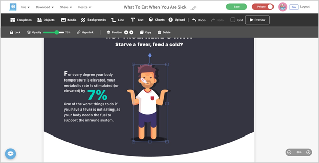
To create your infographic, you need to use a tool like Easel.ly since it makes the creation process smooth and easy. There are hundreds of infographic templates that have been professionally designed for you. You can customize your preferred template with charts, icons, images, and illustrations.
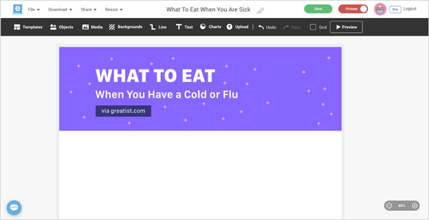
First step: Create a headline
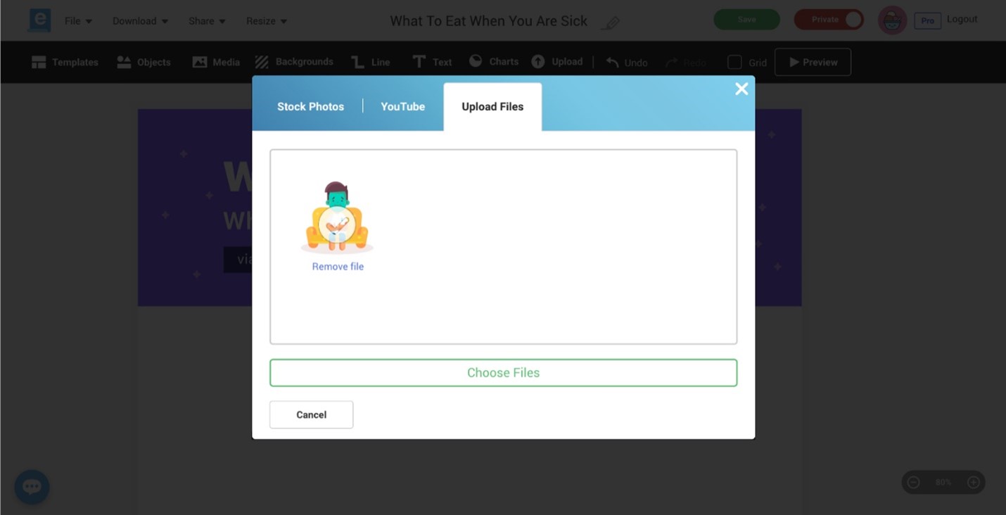
Second step: Upload icons and images
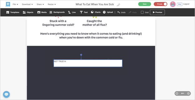
Third step: Include copy and content from your wireframe
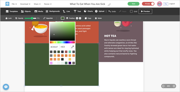
Fourth step: Adjust your background colors
Fifth step: Upload icons and images
Final step: Add a call to action and your brand at the bottom
Conclusion
Your infographic will be useless if it contains a lot of typos and grammatical errors. If possible, have someone look at your work before presenting your work to potential clients.
Emma Coffinet is a content creator for websites, blogs, articles, white papers, and social media platforms, assignment help, such as at EduGeeksClub. She is keen on capturing the attention of a target audience. She keeps herself well-read with the changing trends of the web world. Emma loves to pen down her knowledge in an engaging and simplified way. She also enjoys leading, motivating, and being part of a productive team; equally comfortable working on her own initiative. Feel free to connect with her on Twitter.

